What to use when you have multiple options in a form field
A few days ago, Javier wrote an article explaining the advantages and disadvantages of using select instead of input. In this article, we will expand this thought further. We are going to analyse different cases based on the number of options the user has.
When the user has 2 options
The classic components with HTML would be a checkbox, a radio button or a select. However, all of them present some problems.
Checkbox
When using a checkbox, the unselected option is not clear at all. The user has to imagine what happens when the box stays checked or unchecked. If the checkbox is by default unchecked, we do not have a clue about what is the chosen option.

You need to read the label, think about it and decide. The copy must be very clear so the user doesn’t have any doubts. Remember, as user testing usually shows, people do not read.
Radio button
Compared to checkboxes, radio buttons are better as they show both options. You also know which one is selected by default. The main disadvantage is that you need more space in the form. The default HTML radio button was designed to be used with a mouse, but it doesn’t work so well with the interaction that happens on a touch screen. As it’s too small.

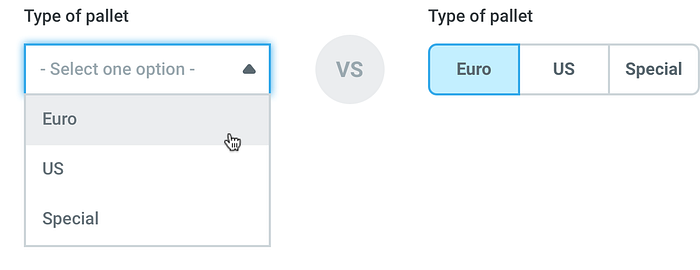
Select
A select is too awkward for just two options. If the default state is empty, the user has to click two times to select one. If the first option is a default, the user has to also click twice to choose the second. Discoverability in select elements with a default option is much lower. Some users may not perceive that inside a select they have more choices. Therefore, they may think they do not need to change it.

Segmented button
We use this component a lot at OnTruck. Segmented buttons are really clear for the user. Changing the option takes only one click or tap and it occupies less visual space. Also, segmented buttons are more discoverable and touch friendly.

Since we (designers) have lately favoured flat UI over skeumorfism, sometimes users doubt about which option is the active one. In the example below, we are not really sure which option is selected.

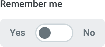
The switch
When touch devices became mainstream, especially after the iPhone was introduced, the “switch” component was widely used for dual selection.

The main problem here is that the status can be confused with the action. This was a common issue in previous interfaces, when “ON” and “OFF”, for example, were inside the switch. Some users will think “ON is what I want”, instead of “ON is what is selected”.

To solve this kind of situation, I really recommend presenting the component like this:
When the user has 3, 4 or 5 options
In this case, the elements we can choose from are radio buttons, a select or segmented buttons. The last being the best component. The reasoning behind this is the same as when the user has two options. Segmented buttons are clearer, faster to fill and occupy less space.
When the user has 6 or more options
With more than 5 options, it’s better to use a select. The main reason is that if you have many elements in the interface, signal becomes noise. However, designing a great select is tricky and you’ll see why in our next article.
We are hiring Senior Product Designers and Product Managers. OnTruck is leading the disruption of the logistics sector in Europe and we have been invested by top investment funds in Europe like Atomico (UK), Idinvest (France), PointNine (Germany) and Samaipata (Spain). If you want to really contribute to a better world and challenge yourself everyday, let’s talk!

